# Plot seagrass lengths
library(ggplot2)
library(patchwork)
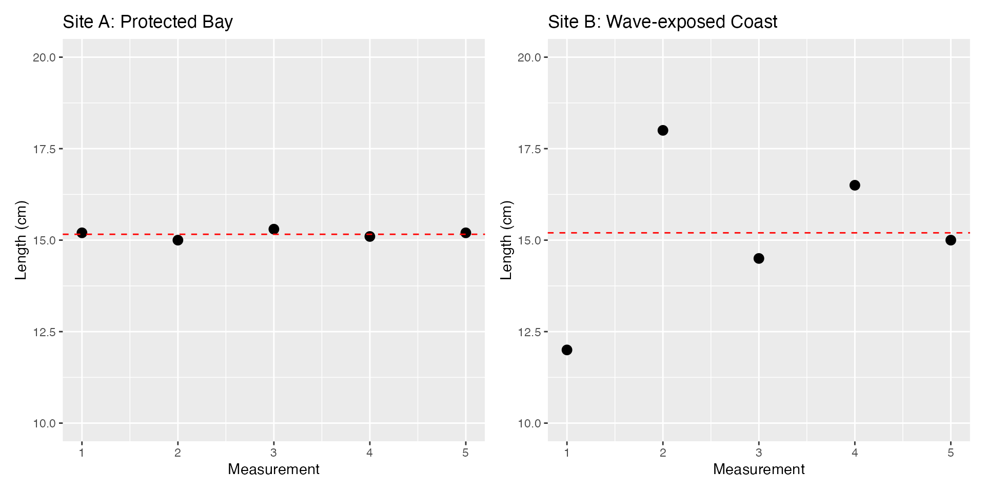
seagrass_protected <- c(15.2, 15.0, 15.3, 15.1, 15.2)
seagrass_exposed <- c(12.0, 18.0, 14.5, 16.5, 15.0)
# Create plots for both sites
p1 <- ggplot() +
geom_point(aes(x = 1:5, y = seagrass_protected), size = 3) +
geom_hline(yintercept = mean(seagrass_protected), linetype = "dashed", color = "red") +
labs(title = "Site A: Protected Bay", x = "Measurement", y = "Length (cm)") +
ylim(10, 20)
p2 <- ggplot() +
geom_point(aes(x = 1:5, y = seagrass_exposed), size = 3) +
geom_hline(yintercept = mean(seagrass_exposed), linetype = "dashed", color = "red") +
labs(title = "Site B: Wave-exposed Coast", x = "Measurement", y = "Length (cm)") +
ylim(10, 20)
# Combine plots side by side
p1 + p2


