Lecture 03: Exploring and visualising data

ENVX1002 Statistics in Life and Environmental Sciences

Januar Harianto

The University of Sydney

Mar 2026

Learning outcomes

After this week, you will be able to:

  1. Explore datasets using summary functions and identify data quality issues
  2. Choose appropriate plot types for different kinds of data
  3. Build layered visualisations in R using ggplot2
  4. Interpret distribution shapes, including skewness and kurtosis

Quick checklist

By now you should have…

Why explore data first?

Looking before you leap

Jumping straight into analysis without exploring your data is like navigating without a map. You might arrive somewhere, but probably not where you intended.

Data exploration helps you:

  • Spot problems early (missing values, outliers, errors)
  • Understand what shape your data takes
  • Choose the right analysis method
  • Avoid drawing conclusions from flawed data

The data exploration workflow

A practical sequence for getting to know a new dataset:

  1. Check the structure and data types
  2. Summarise with descriptive statistics
  3. Visualise distributions and relationships
  4. Flag anything unexpected

Quick recap: types of data

R needs to know what kind of data it is working with. Here is the breakdown:

Type Order? Example
Categorical Nominal No Species, blood type
Ordinal Yes Pain scale (mild → severe)
Continuous Interval Temperature in °C
Ratio Height, weight, age

Categorical data groups observations into labels. Continuous data measures quantities on a scale. The distinction matters because each type calls for different summaries and different plots.

How is your data shaped?

“The greatest value of a picture is when it forces us to notice what we never expected to see.” — John Tukey, Exploratory Data Analysis (1977)

The shape of your data influences everything: which summary statistics make sense, which plots to use, and which analyses are valid.

The normal distribution

The most common distribution you will encounter is the normal (or “bell curve”) distribution. It is symmetric, with most values clustered near the centre and fewer in the tails.

  • Defined by two parameters: the mean (μ) and standard deviation (σ)
  • Appears frequently in nature: heights, measurement errors, physiological traits

\[X \sim N(\mu, \sigma^2)\]

This notation means: the variable \(X\) follows a normal distribution with mean \(\mu\) and variance \(\sigma^2\).

What does a normal distribution look like?

Code
# Generate normal distribution data
set.seed(123)
normal_data <- rnorm(1000, mean = 0, sd = 1)

# Plot normal distribution
ggplot(data.frame(x = normal_data), aes(x = x)) +
  geom_histogram(aes(y = after_stat(density)),
                 bins = 30,
                 fill = "skyblue",
                 colour = "black") +
  geom_density(colour = "red") +
  labs(title = "Standard Normal Distribution (μ = 0, σ = 1)",
       x = "Value",
       y = "Density")

The empirical rule (68-95-99.7)

For a normal distribution, the mean, median, and mode are all the same value. The data clusters predictably around that centre:

  • About 68% of values fall within 1 standard deviation of the mean
  • About 95% within 2 standard deviations
  • About 99.7% within 3 standard deviations

The empirical rule, visualised

This pattern makes the normal distribution especially useful: if you know the mean and standard deviation, you already know where most of the data sits.

Code
# Create a standard normal distribution
x <- seq(-4, 4, length.out = 1000)
y <- dnorm(x)
df <- data.frame(x = x, y = y)

# Plot with empirical rule highlighted
ggplot(df, aes(x = x, y = y)) +
  geom_line() +
  # Add vertical reference lines at standard deviations
  geom_vline(xintercept = c(-3, -2, -1, 0, 1, 2, 3), linetype = "dashed", colour = "gray50", alpha = 0.7) +
  geom_area(data = subset(df, x >= -1 & x <= 1), fill = "darkblue", alpha = 0.3) +
  geom_area(data = subset(df, (x >= -2 & x < -1) | (x > 1 & x <= 2)), fill = "darkgreen", alpha = 0.3) +
  geom_area(data = subset(df, (x >= -3 & x < -2) | (x > 2 & x <= 3)), fill = "darkred", alpha = 0.3) +
  annotate("text", x = 0, y = 0.2, label = "68%", colour = "darkblue") +
  annotate("text", x = 1.5, y = 0.1, label = "95%", colour = "darkgreen") +
  annotate("text", x = 2.5, y = 0.05, label = "99.7%", colour = "darkred") +
  labs(title = "Normal Distribution: Empirical Rule",
       x = "Standard Deviations from Mean",
       y = "Density")

Why does this matter?

Many biological measurements follow a normal distribution. If you know your data is roughly normal, you can predict where most values will land and spot anything unusual.

Code
# Simulate plant height data
set.seed(456)
plant_heights <- rnorm(200, mean = 25, sd = 3)  # Heights in cm

# Plot the distribution
ggplot(data.frame(height = plant_heights), aes(x = height)) +
  geom_histogram(aes(y = after_stat(density)),
                 bins = 20,
                 fill = "#66c2a5",
                 colour = "black") +
  geom_density(colour = "#1f78b4", linewidth = 1) +
  geom_vline(xintercept = 25, linetype = "dashed", colour = "red") +
  annotate("text", x = 25.5, y = 0.05, label = "μ = 25 cm", colour = "red") +
  labs(title = "Distribution of Plant Heights in a Population",
       x = "Height (cm)",
       y = "Density")

Here, plant heights cluster around a mean of 25 cm. A plant measuring 35 cm would be more than 3 standard deviations from the mean, making it a clear outlier worth investigating.

But what if the data is not symmetric?

Not all data follows a neat bell curve. When a distribution leans to one side, we call it skewed. The direction of the longer tail tells you the type of skew, and it shifts the mean away from the median.

Positive skew (right-skewed)

The tail stretches to the right, pulling the mean above the median. Common in income data, reaction times, and species abundance counts.

Code
# Generate positive skewed distribution
set.seed(123)
right_skewed <- exp(rnorm(1000, 0, 0.5))

# Calculate statistics
mean_val <- mean(right_skewed)
median_val <- median(right_skewed)

# Plot positive skewed distribution
ggplot(data.frame(x = right_skewed), aes(x = x)) +
  geom_histogram(aes(y = after_stat(density)),
                 bins = 30,
                 fill = "#66c2a5", # colourblind-friendly green
                 colour = "black") +
  geom_density(colour = "#1f78b4", linewidth = 1) +
  # Add vertical lines for mean and median
  geom_vline(xintercept = mean_val, colour = "red", linetype = "dashed", linewidth = 1) +
  geom_vline(xintercept = median_val, colour = "blue", linetype = "dashed", linewidth = 1) +
  # Add annotations
  annotate("text", x = mean_val + 0.2, y = 0.5, label = paste("Mean =", round(mean_val, 2)), colour = "red") +
  annotate("text", x = median_val - 0.2, y = 0.4, label = paste("Median =", round(median_val, 2)), colour = "blue") +
  labs(title = "Positive skew (right-skewed)",
       subtitle = "Note that Mean > Median",
       x = "Value",
       y = "Density")

Negative skew (left-skewed)

The tail stretches to the left, pulling the mean below the median. Less common, but seen in exam scores near a ceiling or age at retirement.

Code
# Generate skewed distributions
set.seed(123)
left_skewed <- max(right_skewed) - right_skewed + min(right_skewed)

# Calculate statistics
mean_val <- mean(left_skewed)
median_val <- median(left_skewed)

# Plot negative skewed distribution
ggplot(data.frame(x = left_skewed), aes(x = x)) +
  geom_histogram(aes(y = after_stat(density)),
                 bins = 30,
                 fill = "#8da0cb", # colourblind-friendly blue
                 colour = "black") +
  geom_density(colour = "#1f78b4", linewidth = 1) +
  # Add vertical lines for mean and median
  geom_vline(xintercept = mean_val, colour = "red", linetype = "dashed", linewidth = 1) +
  geom_vline(xintercept = median_val, colour = "blue", linetype = "dashed", linewidth = 1) +
  # Add annotations
  annotate("text", x = mean_val - 0.2, y = 0.5, label = paste("Mean =", round(mean_val, 2)), colour = "red") +
  annotate("text", x = median_val + 0.2, y = 0.4, label = paste("Median =", round(median_val, 2)), colour = "blue") +
  labs(title = "Negative skew (left-skewed)",
       subtitle = "Note that Mean < Median",
       x = "Value",
       y = "Density")

Kurtosis: how heavy are the tails?

Kurtosis describes whether a distribution has heavy tails (more extreme values than expected) or light tails (fewer extremes). It is not about how “peaked” the distribution looks, despite what some textbooks say.

  • Mesokurtic: a normal distribution (the baseline)
  • Leptokurtic: heavier tails, more outliers
  • Platykurtic: lighter tails, fewer outliers

Kurtosis, visualised

Compare these three distributions. They all have the same mean and similar spread, but their tails behave very differently.

Code
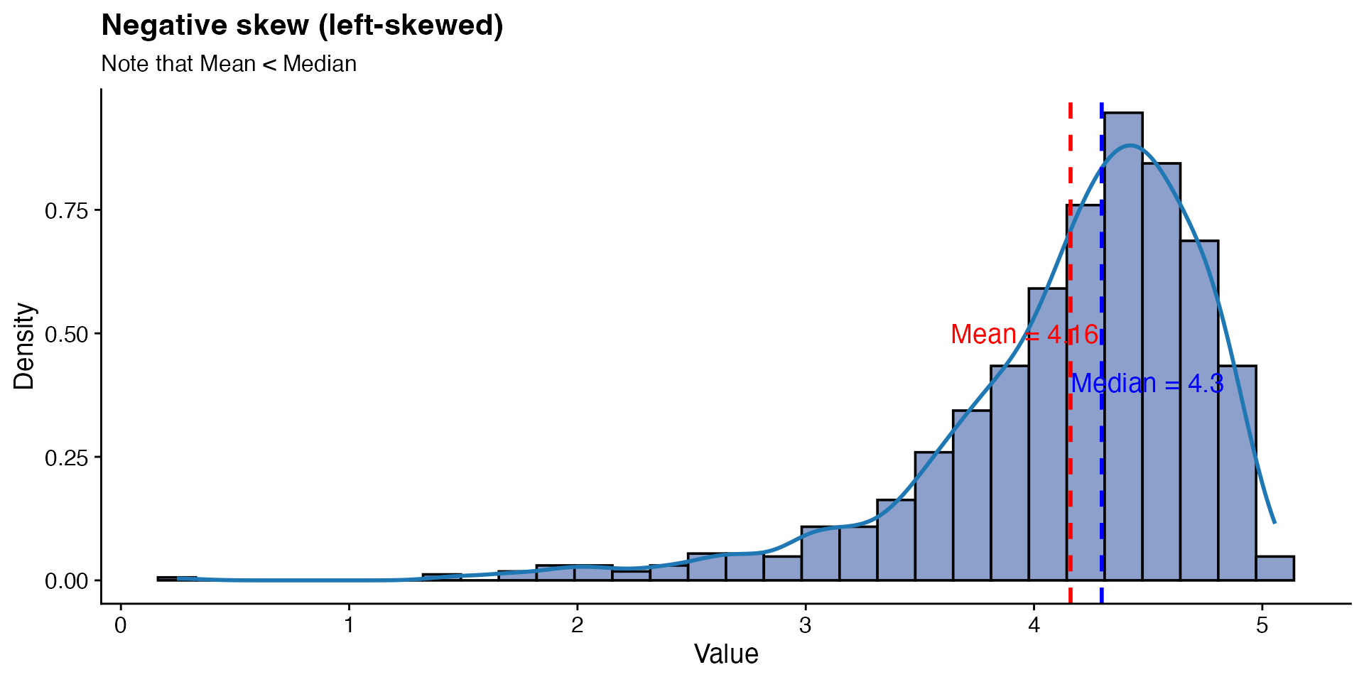
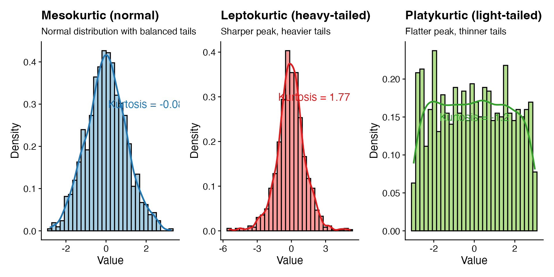
# Generate distributions with different kurtosis
set.seed(123)
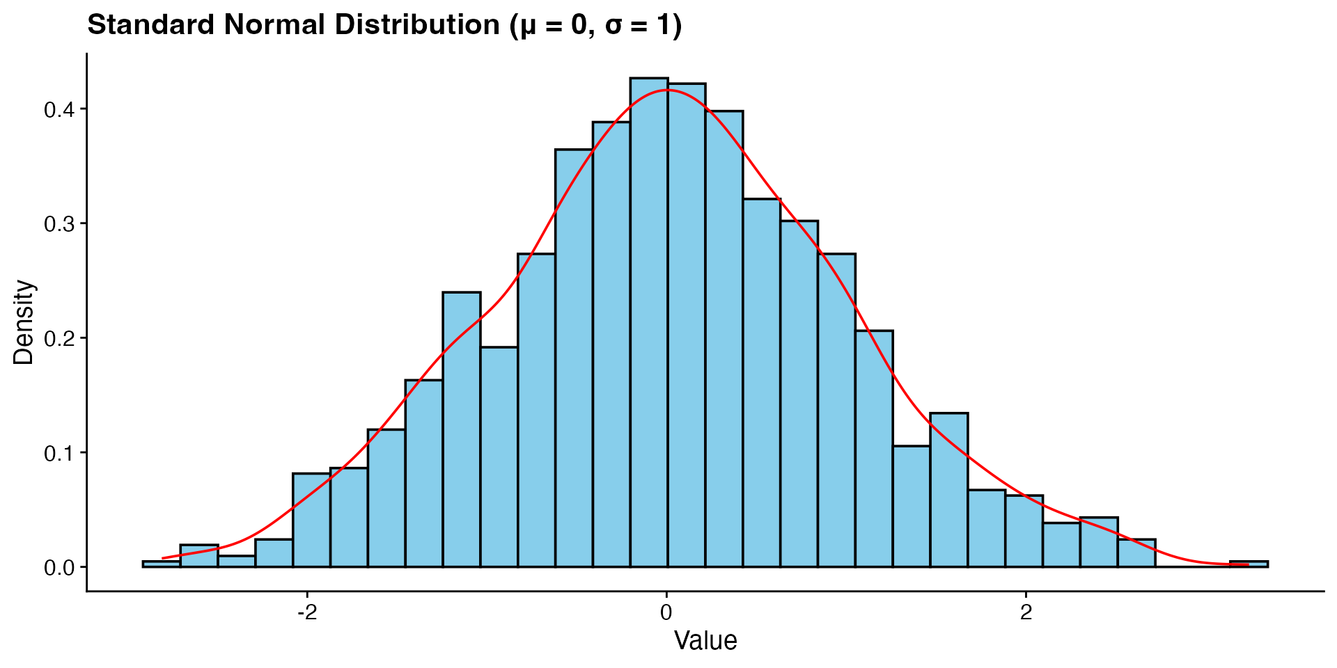
normal <- rnorm(1000, 0, 1)  # Mesokurtic
leptokurtic <- rt(1000, df = 5)  # t-distribution with 5 df is leptokurtic
platykurtic <- runif(1000, -3, 3)  # Uniform distribution is platykurtic

# Calculate kurtosis values (using e1071 package)
library(e1071)
k_normal <- kurtosis(normal)
k_lepto <- kurtosis(leptokurtic)
k_platy <- kurtosis(platykurtic)

# Plot distributions
p1 <- ggplot(data.frame(x = normal), aes(x = x)) +
  geom_histogram(aes(y = after_stat(density)), bins = 30,
                 fill = "#a6cee3", # colourblind-friendly blue
                 colour = "black") +
  geom_density(colour = "#1f78b4", linewidth = 1) + # Darker blue
  annotate("text", x = 2, y = 0.3,
           label = paste("Kurtosis =", round(k_normal, 2)),
           colour = "#1f78b4") +
  labs(title = "Mesokurtic (normal)",
       subtitle = "Normal distribution with balanced tails",
       x = "Value",
       y = "Density")

p2 <- ggplot(data.frame(x = leptokurtic), aes(x = x)) +
  geom_histogram(aes(y = after_stat(density)), bins = 30,
                 fill = "#fb9a99", # colourblind-friendly pink
                 colour = "black") +
  geom_density(colour = "#e31a1c", linewidth = 1) + # Darker red
  annotate("text", x = 2, y = 0.3,
           label = paste("Kurtosis =", round(k_lepto, 2)),
           colour = "#e31a1c") +
  labs(title = "Leptokurtic (heavy-tailed)",
       subtitle = "Sharper peak, heavier tails",
       x = "Value",
       y = "Density")

p3 <- ggplot(data.frame(x = platykurtic), aes(x = x)) +
  geom_histogram(aes(y = after_stat(density)), bins = 30,
                 fill = "#b2df8a", # colourblind-friendly green
                 colour = "black") +
  geom_density(colour = "#33a02c", linewidth = 1) + # Darker green
  annotate("text", x = 0, y = 0.15,
           label = paste("Kurtosis =", round(k_platy, 2)),
           colour = "#33a02c") +
  labs(title = "Platykurtic (light-tailed)",
       subtitle = "Flatter peak, thinner tails",
       x = "Value",
       y = "Density")

# Display plots vertically
library(patchwork)
p1 + p2 + p3

Exploring data in R

Data structures you will use

The two structures you will work with most in this course:

Vectors: a single row of values

heights <- c(1.65, 1.70, 1.75, 1.80, 1.85)
heights
[1] 1.65 1.70 1.75 1.80 1.85

Data frames: a table with rows and columns (like a spreadsheet)

df <- data.frame(
  species = c("A", "B", "C", "A", "B"),
  height = c(1.65, 1.70, 1.75, 1.80, 1.85),
  weight = c(60, 65, 70, 75, 80)
)
df
  species height weight
1       A   1.65     60
2       B   1.70     65
3       C   1.75     70
4       A   1.80     75
5       B   1.85     80

Getting to know your data

A few functions that give you an immediate overview:

str(df)
'data.frame':   5 obs. of  3 variables:
 $ species: chr  "A" "B" "C" "A" ...
 $ height : num  1.65 1.7 1.75 1.8 1.85
 $ weight : num  60 65 70 75 80
summary(df)
   species              height         weight  
 Length:5           Min.   :1.65   Min.   :60  
 Class :character   1st Qu.:1.70   1st Qu.:65  
 Mode  :character   Median :1.75   Median :70  
                    Mean   :1.75   Mean   :70  
                    3rd Qu.:1.80   3rd Qu.:75  
                    Max.   :1.85   Max.   :80  
unique(df$species)
[1] "A" "B" "C"

summary() is useful, but it does not always reveal the full picture.

Visualising missing data

The naniar package can show you exactly where values are missing, which is much easier to interpret than scanning raw output.

library(naniar)
vis_miss(airquality)

Seeing vs reading

Compare the vis_miss() output to the raw data below. Which one makes the missing values easier to spot?

airquality$Ozone
  [1]  41  36  12  18  NA  28  23  19   8  NA   7  16  11  14  18  14  34   6
 [19]  30  11   1  11   4  32  NA  NA  NA  23  45 115  37  NA  NA  NA  NA  NA
 [37]  NA  29  NA  71  39  NA  NA  23  NA  NA  21  37  20  12  13  NA  NA  NA
 [55]  NA  NA  NA  NA  NA  NA  NA 135  49  32  NA  64  40  77  97  97  85  NA
 [73]  10  27  NA   7  48  35  61  79  63  16  NA  NA  80 108  20  52  82  50
 [91]  64  59  39   9  16  78  35  66 122  89 110  NA  NA  44  28  65  NA  22
[109]  59  23  31  44  21   9  NA  45 168  73  NA  76 118  84  85  96  78  73
[127]  91  47  32  20  23  21  24  44  21  28   9  13  46  18  13  24  16  13
[145]  23  36   7  14  30  NA  14  18  20
summary(airquality$Ozone)
   Min. 1st Qu.  Median    Mean 3rd Qu.    Max.    NA's 
   1.00   18.00   31.50   42.13   63.25  168.00      37 

Histograms: the shape of continuous data

Use histograms when you want to see how a continuous variable is distributed. They reveal the centre, spread, and any skewness or outliers at a glance.

Code
hist(penguins$body_mass_g,
     main = "Distribution of Penguin Body Mass",
     xlab = "Body Mass (g)",
     col = "skyblue",
     border = "white")

Bar plots: comparing categories

Bar plots show counts or proportions across groups. Use them for categorical data like species, treatments, or survey responses.

Code
species_counts <- table(penguins$species)
barplot(species_counts,
        main = "Count of Penguins by Species",
        xlab = "Species", ylab = "Count",
        col = c("darkorange", "purple", "cyan4"),
        border = "white")

Scatterplots: relationships between variables

Scatterplots show how two continuous variables relate to each other. They are the go-to plot for spotting correlations, clusters, and outliers.

Code
penguins_clean <- na.omit(penguins[, c("flipper_length_mm", "body_mass_g")])
plot(penguins_clean$flipper_length_mm, penguins_clean$body_mass_g,
     main = "Relationship Between Flipper Length and Body Mass",
     xlab = "Flipper Length (mm)", ylab = "Body Mass (g)",
     pch = 19, col = "darkblue")

Boxplots: comparing distributions across groups

Boxplots summarise the median, quartiles, and outliers for each group. They are ideal for comparing a continuous variable across categories.

Code
boxplot(body_mass_g ~ species, data = penguins,
        main = "Body Mass by Penguin Species",
        xlab = "Species", ylab = "Body Mass (g)",
        col = c("darkorange", "purple", "cyan4"),
        border = "black")

Introduction to ggplot2

A grammar for graphics

ggplot2 builds plots from three core ingredients:

  1. Data: the dataset
  2. Aesthetics (aes): which variables map to x, y, colour, size, etc.
  3. Geometries (geom_*): how the data is drawn (points, bars, lines, etc.)

You combine these with + to build a plot layer by layer. As you get more comfortable, you can add scales, facets, and themes to refine the result.

Building a plot: Step 1 - Start with data

Let’s build a scatterplot of penguin flipper length vs. body mass using the palmerpenguins dataset.

First, we need to load the ggplot2 package and prepare our data:

Code
library(ggplot2)
# Remove missing values for this example
penguins_clean <- na.omit(penguins)

# Look at the first few rows of our data
head(penguins_clean[, c("species", "flipper_length_mm", "body_mass_g")])
# A tibble: 6 × 3
  species flipper_length_mm body_mass_g
  <fct>               <int>       <int>
1 Adelie                181        3750
2 Adelie                186        3800
3 Adelie                195        3250
4 Adelie                193        3450
5 Adelie                190        3650
6 Adelie                181        3625

Building a plot: Step 2 - Create a blank canvas

The ggplot() function initialises a plot with data:

Code
# Create a blank canvas with our data
p <- ggplot(penguins_clean)
p

This creates an empty plot. We need to add layers to visualise our data.

Building a plot: Step 3 - Add aesthetics

Aesthetics map variables in the data to visual properties:

Code
# Add aesthetics mapping
p <- ggplot(penguins_clean, aes(x = flipper_length_mm, y = body_mass_g))
p

We’ve defined which variables go on which axes, but we still need to specify how to represent the data.

Building a plot: Step 4 - Add a geometry

Geometries define how the data is represented visually:

Code
# Add points geometry
p <- ggplot(penguins_clean, aes(x = flipper_length_mm, y = body_mass_g)) +
  geom_point()
p

Now we can see the relationship between flipper length and body mass!

Building a plot: Step 5 - Add colour by species

We can map the species variable to the colour aesthetic:

Code
# colour points by species
p <- ggplot(penguins_clean, aes(x = flipper_length_mm, y = body_mass_g, colour = species)) +
  geom_point()
p

Notice how ggplot2 automatically creates a legend for the species colours.

Building a plot: Step 6 - Customise point appearance

We can adjust the size and transparency of points:

Code
# Customize point appearance
p <- ggplot(penguins_clean, aes(x = flipper_length_mm, y = body_mass_g, colour = species)) +
  geom_point(size = 3, alpha = 0.7)
p

Building a plot: Step 7 - Add labels and title

Let’s add informative labels and a title:

Code
# Add labels and title
p <- ggplot(penguins_clean, aes(x = flipper_length_mm, y = body_mass_g, colour = species)) +
  geom_point(size = 3, alpha = 0.7) +
  labs(
    title = "Relationship Between Flipper Length and Body Mass",
    subtitle = "Palmer Penguins Dataset",
    x = "Flipper Length (mm)",
    y = "Body Mass (g)",
    colour = "Penguin Species"
  )
p

Building a plot: Step 8 - Customise colours

We can use a custom colour palette:

Code
# Customize colours
p <- ggplot(penguins_clean, aes(x = flipper_length_mm, y = body_mass_g, colour = species)) +
  geom_point(size = 3, alpha = 0.7) +
  scale_colour_manual(values = c("darkorange", "purple", "cyan4")) +
  labs(
    title = "Relationship Between Flipper Length and Body Mass",
    subtitle = "Palmer Penguins Dataset",
    x = "Flipper Length (mm)",
    y = "Body Mass (g)",
    colour = "Penguin Species"
  )
p

Building a plot: Step 9 - Apply a theme

Finally, let’s apply a theme to change the overall appearance:

Code
# Apply a theme
p <- ggplot(penguins_clean, aes(x = flipper_length_mm, y = body_mass_g, colour = species)) +
  geom_point(size = 3, alpha = 0.7) +
  scale_colour_manual(values = c("darkorange", "purple", "cyan4")) +
  labs(
    title = "Relationship Between Flipper Length and Body Mass",
    subtitle = "Palmer Penguins Dataset",
    x = "Flipper Length (mm)",
    y = "Body Mass (g)",
    colour = "Penguin Species"
  ) +
  theme_minimal() +
  theme(
    legend.position = "bottom",
    plot.title = element_text(face = "bold"),
    axis.title = element_text(face = "italic")
  )
p

Adding more layers: Trend lines

One of the strengths of ggplot2 is the ability to add multiple layers:

Code
# Add trend lines for each species
p + geom_smooth(method = "lm", se = FALSE)

Faceting: Split by species

We can also split the plot into facets by species:

Code
# Create facets by species
p + facet_wrap(~ species)

The complete ggplot2 code

Here’s the complete code for our final plot:

Code
ggplot(penguins_clean, aes(x = flipper_length_mm, y = body_mass_g, colour = species)) +
  geom_point(size = 3, alpha = 0.7) +
  scale_colour_manual(values = c("darkorange", "purple", "cyan4")) +
  labs(
    title = "Relationship Between Flipper Length and Body Mass",
    subtitle = "Palmer Penguins Dataset",
    x = "Flipper Length (mm)",
    y = "Body Mass (g)",
    colour = "Penguin Species"
  ) +
  theme_minimal() +
  theme(
    legend.position = "bottom",
    plot.title = element_text(face = "bold"),
    axis.title = element_text(face = "italic")
  )

Resources for further learning

References and resources

Core reading

  • Wickham, H. (2016). ggplot2: Elegant Graphics for Data Analysis. Springer.
  • Chang, W. (2018). R Graphics Cookbook. O’Reilly Media.
  • Wickham, H., & Grolemund, G. (2017). R for Data Science. O’Reilly Media.

Online resources

Thanks!

This presentation is based on the SOLES Quarto reveal.js template and is licensed under a Creative Commons Attribution 4.0 International License.