library(tidymodels)
library(patchwork)
set.seed(642)
heights <- tibble(heights = rnorm(1000, 1.99, 1))
popmean <- mean(heights$heights)
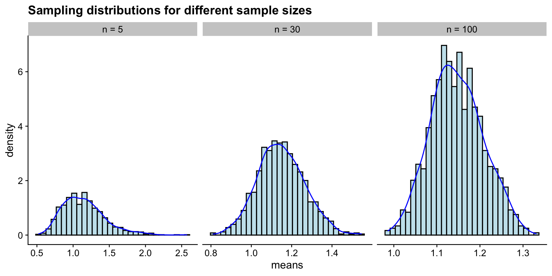
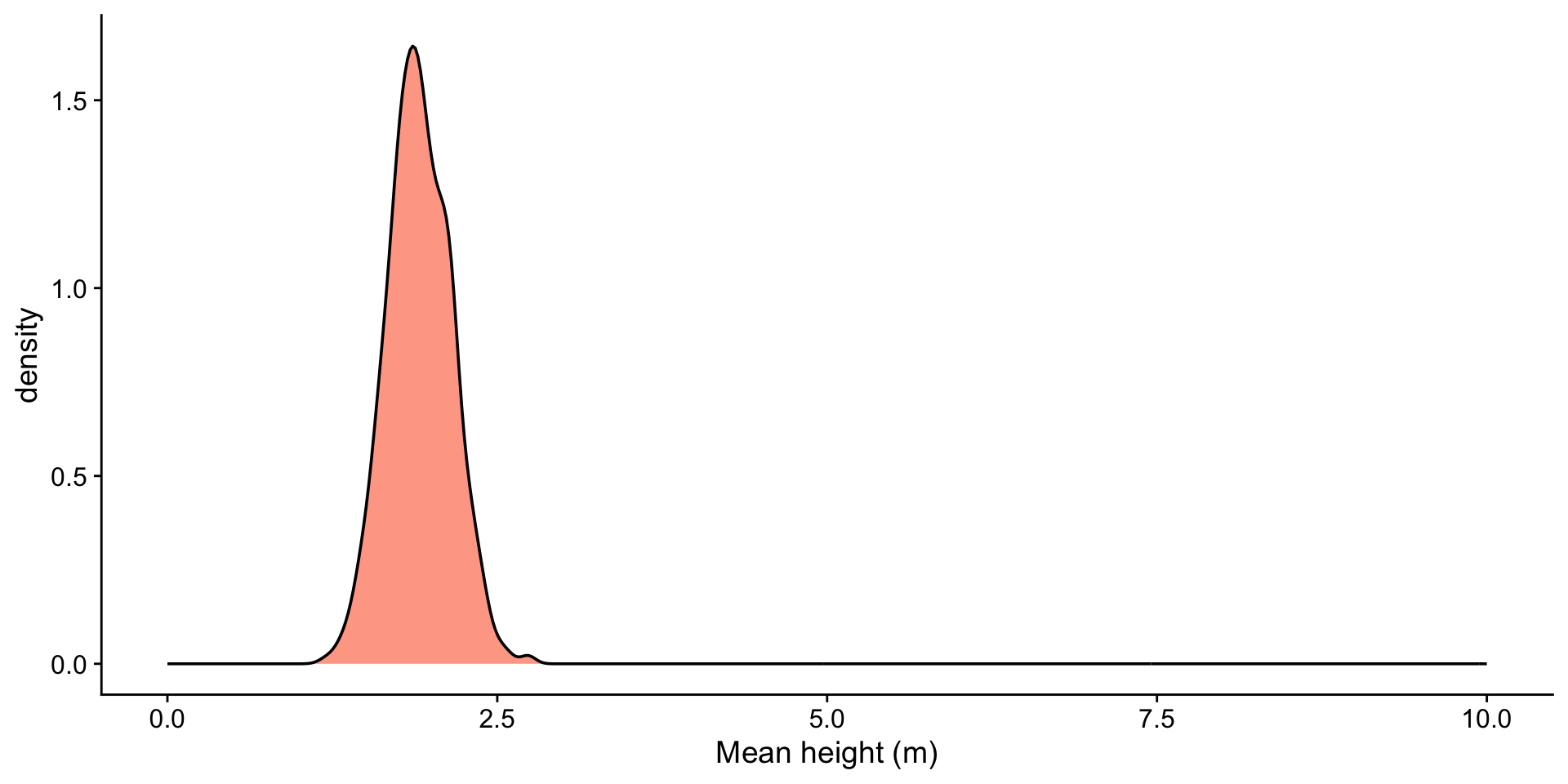
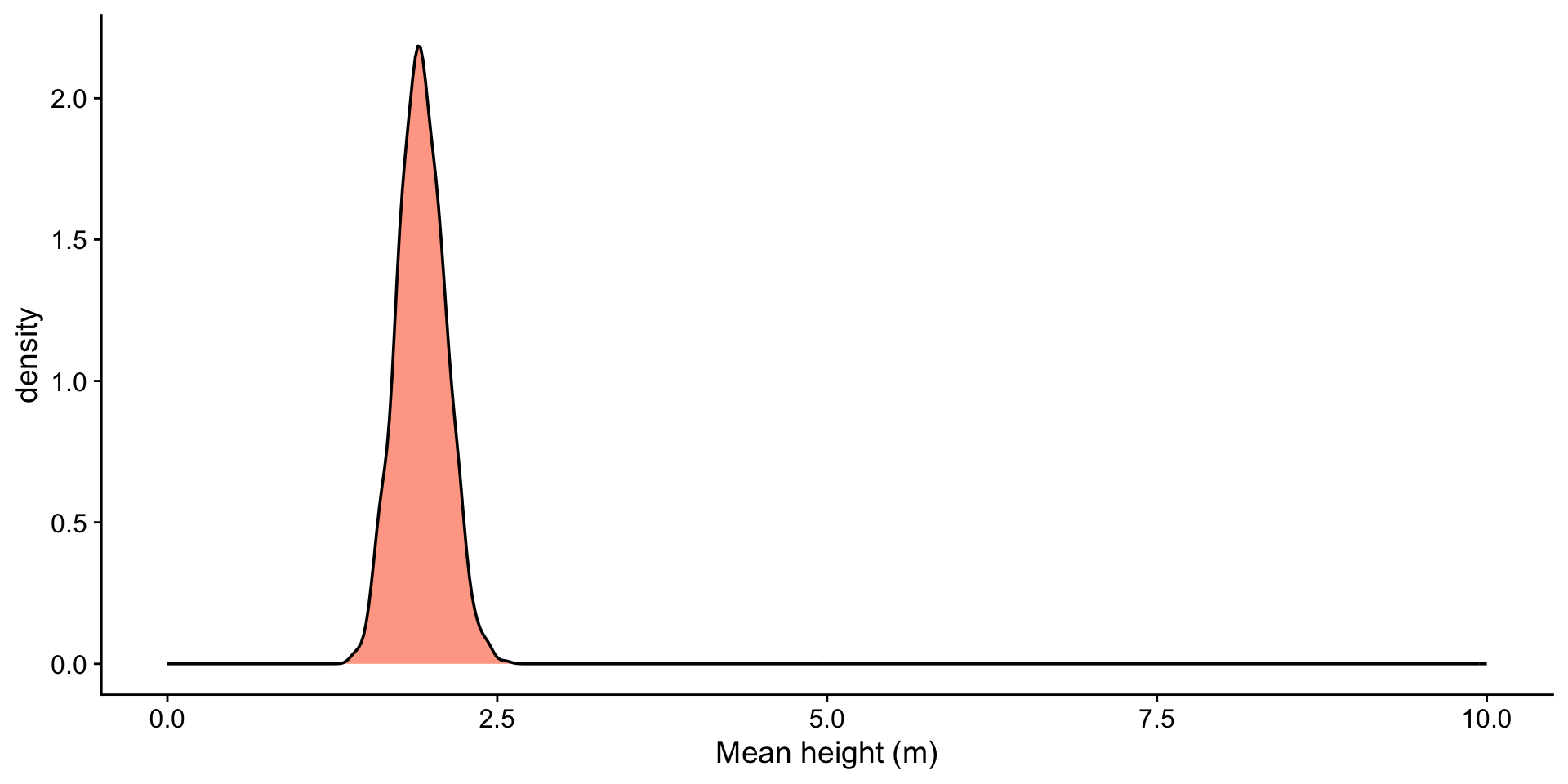
sample_sizes <- c(2, 5, 25, 100)
n <- length(sample_sizes)
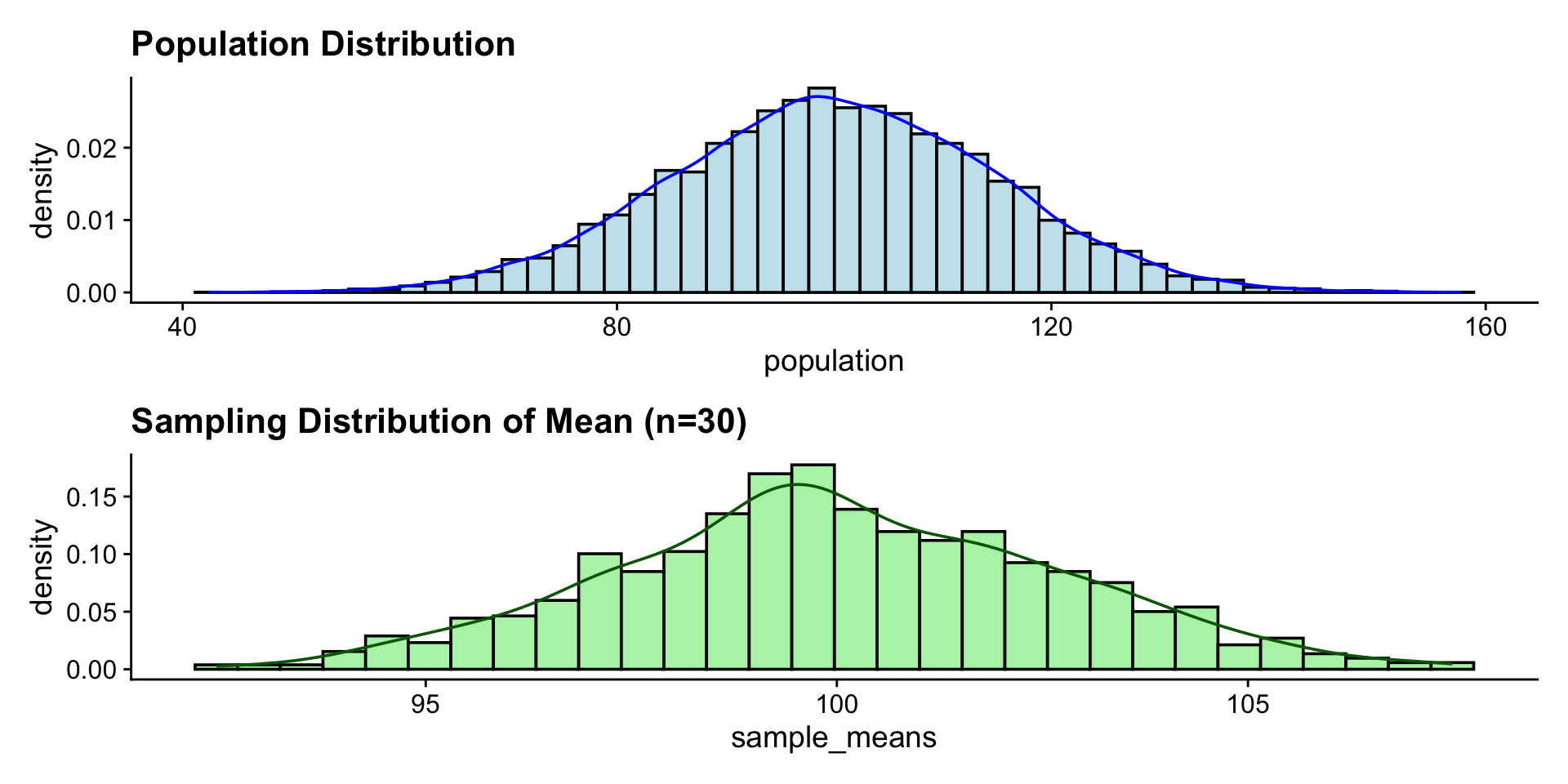
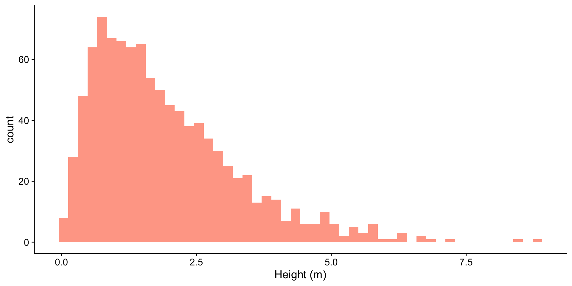
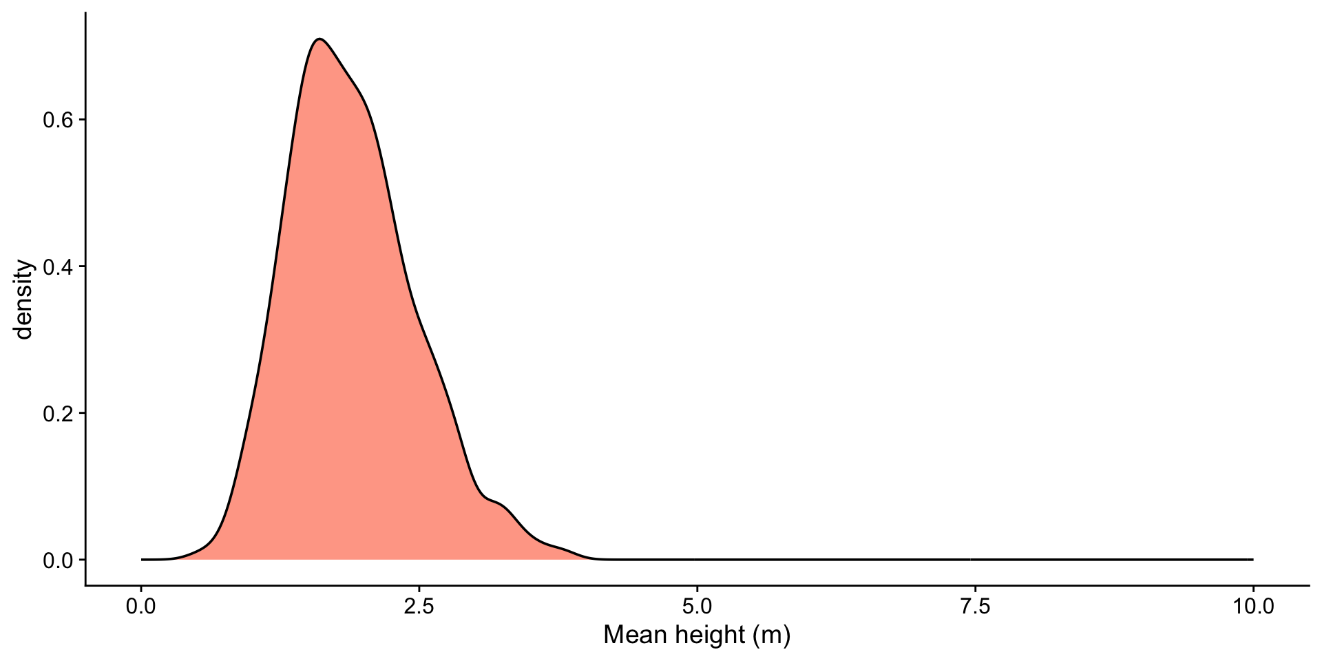
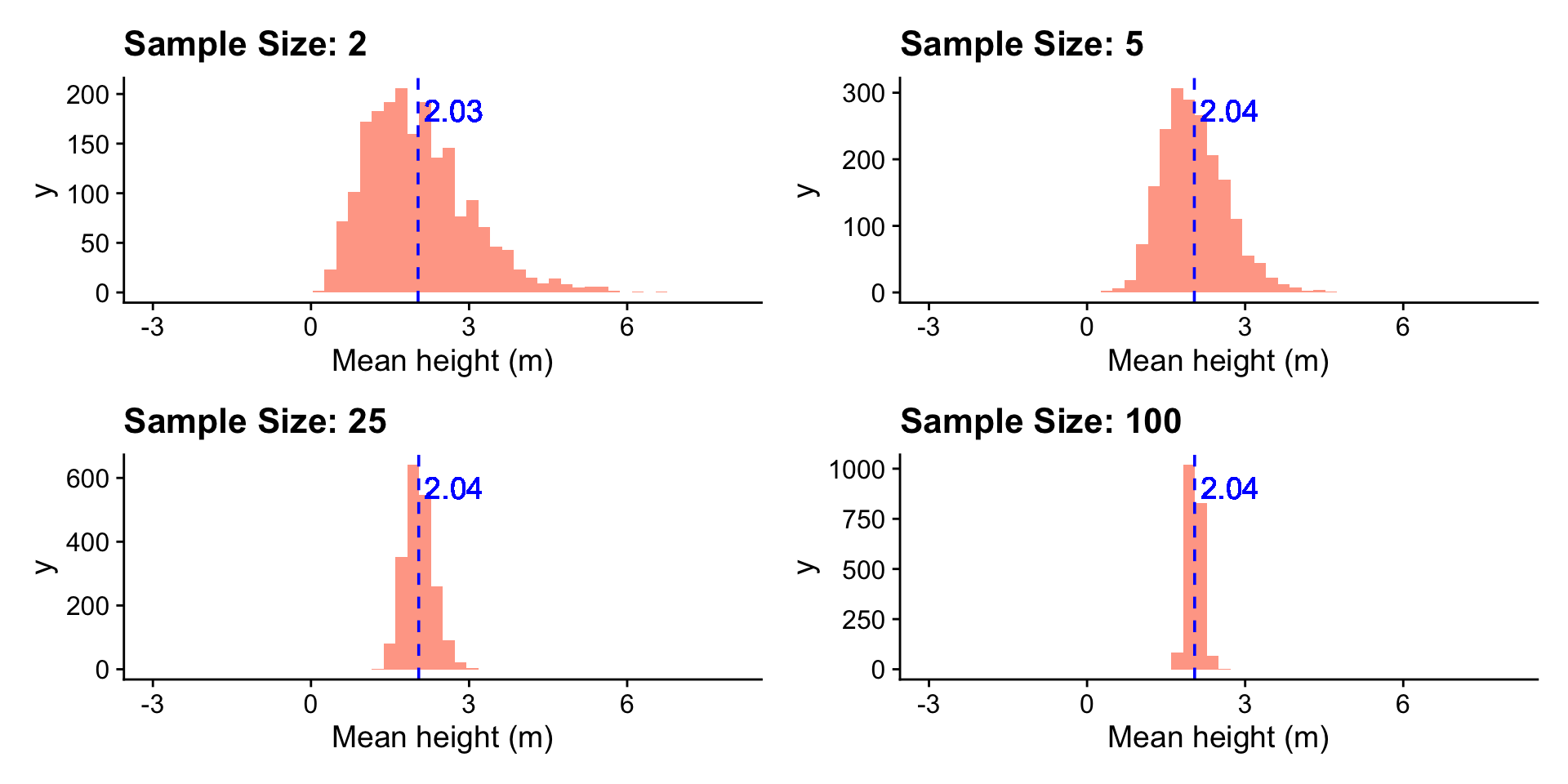
heights <- tibble(heights = rgamma(1000, shape = 2, scale = 1))
sample_sizes <- c(2, 5, 25, 100)
n <- length(sample_sizes)
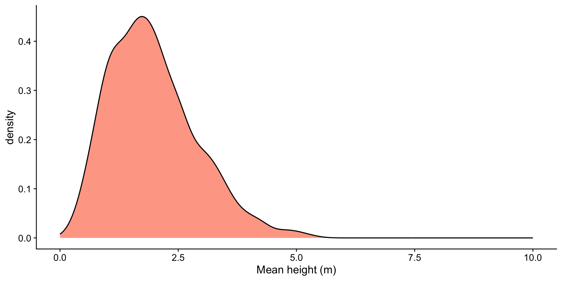
plots <- lapply(sample_sizes, function(size) {
df <- heights |>
rep_sample_n(size = size, reps = 2000) |>
group_by(replicate) |>
summarise(xbar = mean(heights))
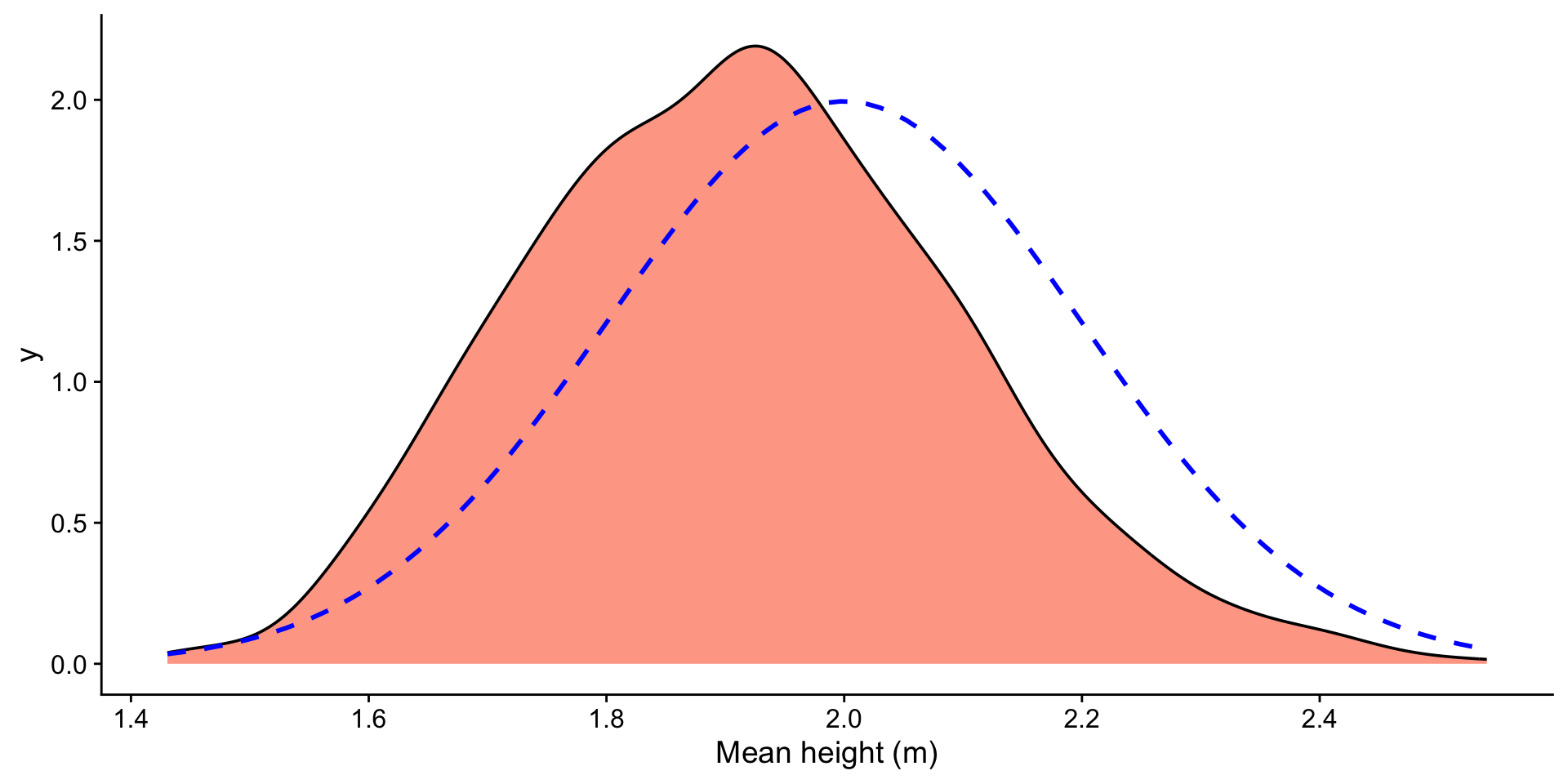
mean_xbar <- mean(df$xbar)
ggplot(df, aes(x = xbar)) +
geom_histogram(fill = "orangered", alpha = 0.5, bins = 50) +
geom_vline(aes(xintercept = mean_xbar), color = "blue", linetype = "dashed") +
geom_text(aes(x = mean_xbar, label = sprintf("%.2f", mean_xbar), y = Inf), hjust = -0.1, vjust = 2, color = "blue") +
ggtitle(paste0("Sample Size: ", size)) +
xlab("Mean height (m)") +
xlim(-3, 8)
})
wrap_plots(plots)